The True Size - Discovering Real Dimensions Of Our World
Ever wondered why Greenland looks so massive compared to Australia on a map, yet it's smaller in reality? Most maps we encounter daily distort the actual sizes of countries due to their projections. Enter "The True Size," an interactive map tool that lets you drag and drop nations to compare their real dimensions. This game-changing resource helps us visualize how big or small places truly are.
Maps have always been tools for navigation, but they often mislead us about the actual scale of landmasses. The Mercator projection, commonly used in classrooms and offices worldwide, stretches areas near the poles, making them appear much larger than they are. It's almost hard to believe that countries like Africa or Russia are far bigger than what we see on regular maps. With "The True Size," you can finally see the world as it really is, with accurate representations of each country's footprint.
Using this tool is simple. You just search for a country or state, drag its outline onto another, and instantly compare sizes. It's a little mind-blowing to realize how much the world's geography differs from what we’ve been taught. For instance, did you know that Africa is 14 times larger than Greenland? Let’s explore more fascinating comparisons and uncover the hidden truths behind the maps we use every day.
Table of Contents
- Why Does Size Matter - The True Size Perspective
- How Do Map Projections Distort Reality?
- What is The True Size Tool?
- How Can We Use The True Size Map?
- Why Should You Care About The True Size?
- How Accurate Are Equal Area Maps?
- What Can You Learn From Comparing Countries?
- Is The True Size Really That Important?
Why Does Size Matter - The True Size Perspective
Size isn’t just about bragging rights. Understanding the true dimensions of countries impacts everything from global trade to cultural exchange. When you realize how much larger some nations are, it changes how you perceive their influence and resources. For example, if you thought Alaska was comparable to Brazil, you’d be surprised to learn that Brazil is nearly five times bigger. This kind of knowledge reshapes our mental image of the world.
So why does this matter? Well, maps play a significant role in shaping our worldview. They’re not just tools for getting from point A to point B; they’re windows into understanding geography, economics, and politics. If we’re basing decisions on flawed maps, we risk making errors in judgment. That’s where The True Size comes in—to give us clarity and accuracy.
How Do Map Projections Distort Reality?
Map projections are tricky things. They attempt to flatten a 3D globe onto a 2D surface, which inevitably leads to distortions. One common culprit is the Mercator projection, which exaggerates landmasses closer to the poles. This makes places like Antarctica and Greenland look enormous, while equatorial regions like Africa appear smaller than they really are.
In some respects, these distortions make sense. Maps need to prioritize certain features, like angles or distances, over others. But when it comes to size, many projections fall short. That’s why equal-area maps, like the Eckert IV, are so valuable. These maps preserve the correct proportions of countries, giving us a more accurate picture of the world. It’s a bit like trading a funhouse mirror for a regular one.
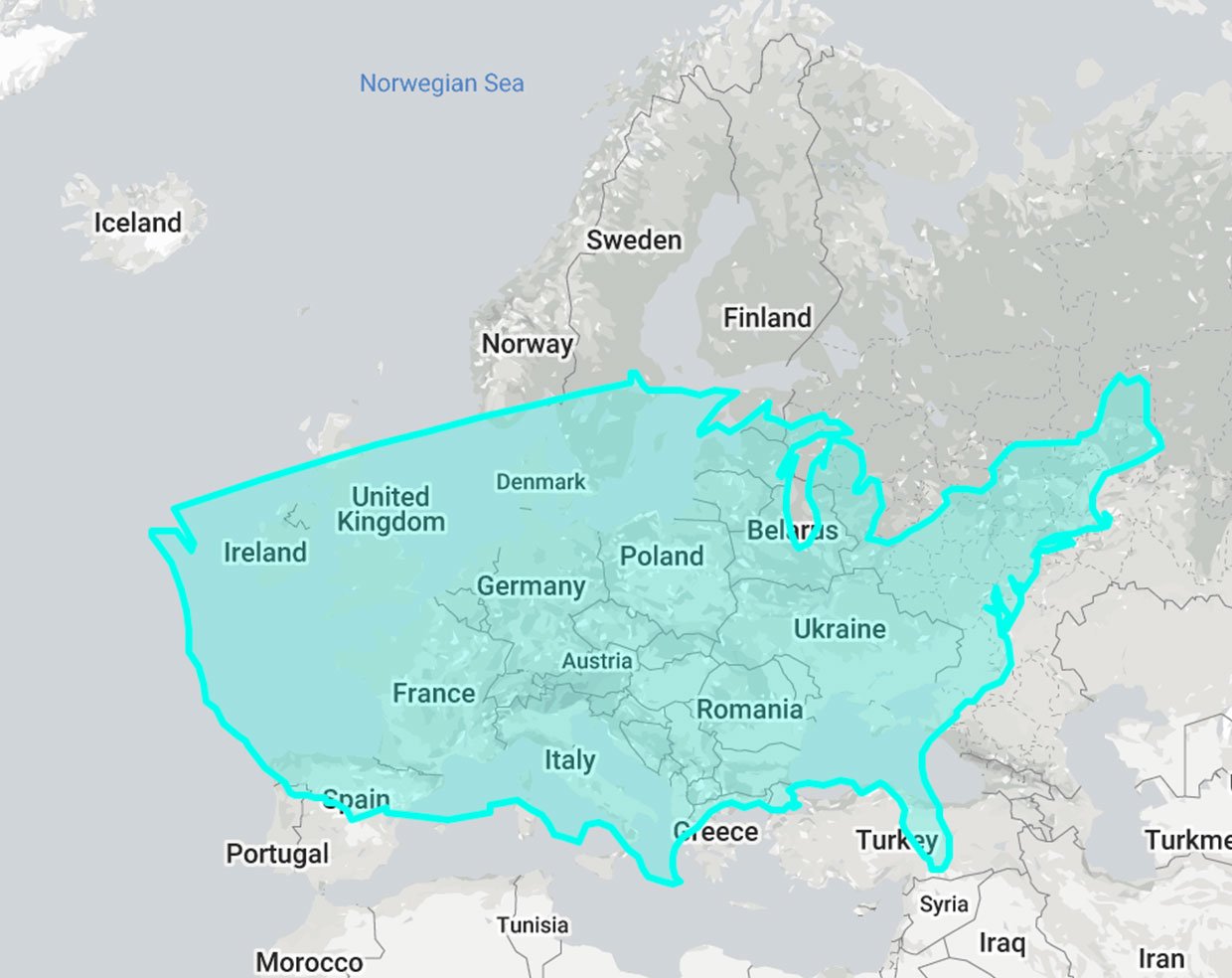
What is The True Size Tool?
The True Size is essentially an online platform that lets you compare the real sizes of countries interactively. You can search for any nation or state, drag its outline onto another, and instantly see how they stack up. It’s a simple idea, but it has profound implications for how we understand geography.
For instance, have you ever thought Massachusetts was comparable to Estonia? Nope! Estonia is actually about twice as large. These kinds of revelations remind us just how much we rely on distorted maps for our perceptions. The True Size doesn’t just offer fun facts—it provides a clearer, more accurate view of the planet we call home.
How Can We Use The True Size Map?
Using The True Size is straightforward. Just head to the website, type in the name of a country or state, and start comparing. You can drag one nation’s outline onto another to see their relative sizes. It’s a great way to debunk myths and challenge assumptions about geography.
Let’s say you want to compare the United States to Africa. On most maps, it looks like the U.S. takes up a decent chunk of the continent. In reality, Africa is 14 times larger. Pretty incredible, right? This tool is perfect for educators, students, and anyone curious about the world around them.
Why Should You Care About The True Size?
Knowing the true size of countries goes beyond mere curiosity. It affects how we interpret global issues, from climate change to population density. For example, understanding that Russia is the largest country by landmass helps explain why its weather patterns vary so wildly. Similarly, realizing how small island nations are compared to continents highlights the challenges they face with rising sea levels.
It’s not just about geography either. Accurate maps influence everything from international relations to resource management. If we’re basing policies or decisions on flawed information, we risk creating problems instead of solving them. The True Size gives us a foundation for making smarter, better-informed choices.
How Accurate Are Equal Area Maps?
Equal-area maps, like the ones used in The True Size tool, are incredibly accurate when it comes to size. They ensure that each country’s area on the map corresponds directly to its real-world dimensions. However, there’s a trade-off: shapes tend to get distorted. Every country’s outline looks a little stretched or squished, but its actual area remains proportional.
This compromise is necessary because no map can perfectly represent a three-dimensional sphere on a flat surface. Eckert IV, one of the most popular equal-area projections, strikes a balance between accuracy and usability. It preserves areas without sacrificing too much in terms of shape. In short, it’s a pretty good deal if you’re looking for reliable geographic data.
What Can You Learn From Comparing Countries?
Comparing countries reveals all sorts of interesting insights. For example, did you know that Japan is roughly the same size as Germany? Or that India is slightly smaller than Australia, despite having a much larger population? These kinds of comparisons help us appreciate the diversity of our planet.
It’s also worth noting that size doesn’t always equate to significance. Some smaller nations punch above their weight in terms of economic or cultural impact. Meanwhile, larger countries face unique challenges due to their vast territories. Exploring these nuances through The True Size encourages a deeper appreciation for the complexity of our world.
Is The True Size Really That Important?
Yes, it absolutely is. Maps shape our understanding of the world, and inaccurate ones can lead to misconceptions that persist for generations. By using tools like The True Size, we can correct those errors and gain a more accurate perspective. It’s not just about geography—it’s about fostering a more informed, globally aware society.
In a way, The True Size bridges the gap between perception and reality. It challenges us to rethink what we think we know and invites us to explore the world with fresh eyes. Whether you’re a student, a teacher, or just someone who loves learning, this tool offers endless possibilities for discovery.
Ultimately, The True Size is more than just an interactive map. It’s a reminder that the world is far more complex and fascinating than we often realize. By exploring its dimensions, we gain a greater appreciation for the diversity and richness of our planet. So go ahead, give it a try—you might be surprised by what you find.
This Map Lets You Compare The Relative Size of Countries

Most Accurate True Size World Map - SKY

The True Size of Africa - Vivid Maps
